Google Fonts can be overwhelming to sort through.
Here are our top five Google Fonts for the web right now (that aren’t Open Sans or Roboto)!
If you are reading this, you are looking at Barlow. I love that it is easy to read but more slight and narrow than Open Sans. It may not be flashy, but it works well for headlines and body text.
Try pairing it with Fira Sans or Roboto.
Speaking of Open Sans, Karla reminds me of it but with a bit more width and interest in the arms like the letter G. Karla is an excellent twist on nothing fancy, aka a basic font.
Karla works super well when it is a thin or a more thick font-weight. In a plain old medium, I find it depressing. Picky, I know!
Try pairing it with Montserrat or Lato
Sign Up to Get Our Latest Posts Tuesdays and Thursdays
No Spam, Period. Just the latest posts.


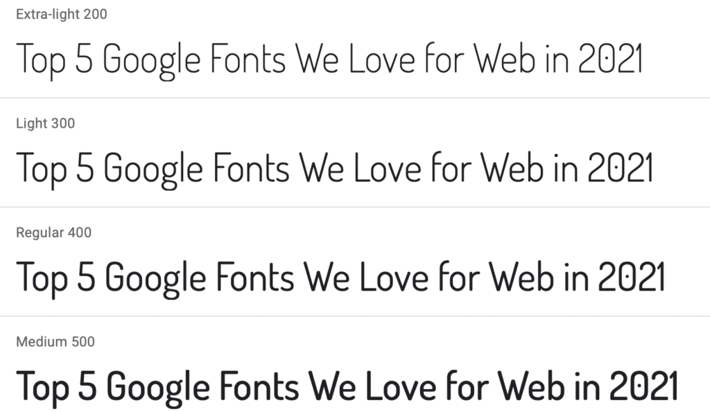
Dosis has a nice slightly roundedness to it that makes it feel modern and soft. It is a great headline font and is perfect for a web app or technology website.
When it gets too heavy, the rounded edges start to look cartoonish to my eye.
Try pairing it with Open Sans or Roboto.
Occasionally we all need an attractive Serif in our lives. Libre Baskerville feels like a perfectly clean typeset serif from 1941 (when the original font is from). When you need to bring in a solid typographic style that communicates professionalism, reach for Libre Baskerville. It is super easy to read without feeling stuffy.
Try pairing with Open Sans or Raleway.
The Londrina font families are a little bit organic. They have slightly wavy lines on the edges, giving it the perfect hint of grunge without going fully early 2000s.
However, my favorite thing about it isn’t the youthful sway in the letters; it’s the variations! It comes with an outline, shadow, and sketch outline version – this means you can bring Londrina into a site and present multiple ways while remaining consistent in style. It’s not going to work for every project, but it works super well when it does. See our highlights page for The Firehouse Community Arts Center as an example.
Try pairing with Barlow or Lato.
Bonus Fonts:
I have to throw in some love for these two fonts.
Permanent Marker is a great font to use when you need that handwritten on a napkin effect. Think about your favorite band’s setlist.
Syne Mono is a fantastic, slightly rough font when you need a little bit of decay in your font. I would use this on a digital infographic or to bring some texture in if a clean font felt too sterile. Syne Mono feels like a typewriter ribbon that is no longer fully inked.
What did I miss?
What are your favorite Google Fonts?


