Google Fonts can be overwhelming to sort through. There are so many options, and let’s be real, not all of them are really worth your time.
In that spirit, we go through a couple times a year and highlight fonts we think are suitable for a variety of different projects to save time during selection. Here are our top five Google Fonts for the web right now.
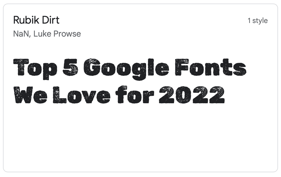
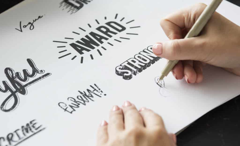
Rubik is an excellent font in its own right, but what if you want a little dirt and grunge? For better or worse, textures are back in some circles, and this Dirt version of Rubik is a perfect way to bring a little texture to your headlines.
I love how this font looks like a typeset letter from the old-school letterpress posters. Rubik Dirt is a solid choice if you want a slightly vintage, bold-inked look for your design!
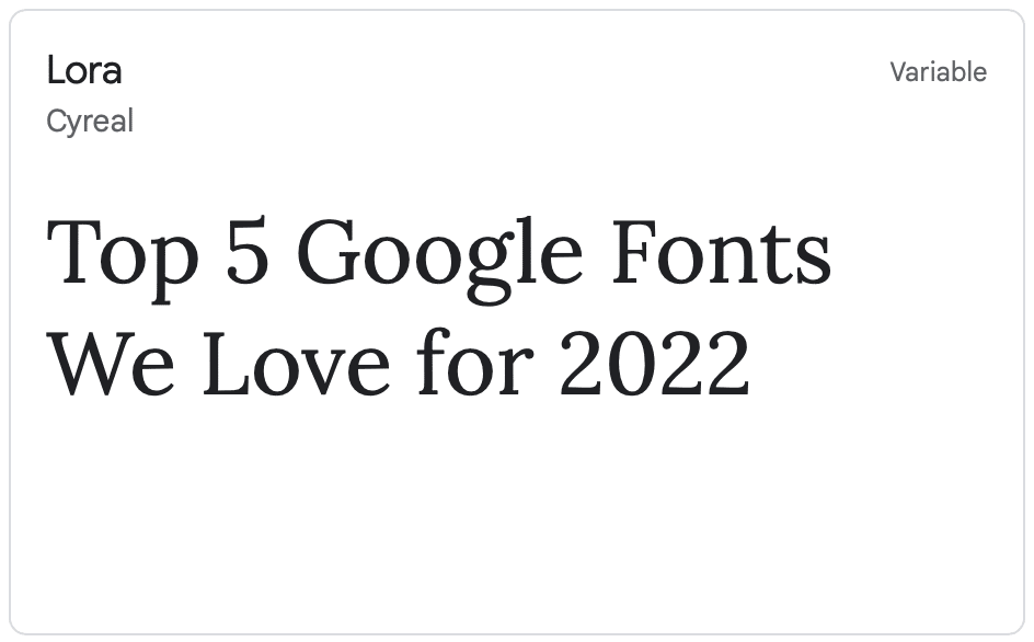
Lora is a calligraphy-inspired Serif font. There will always be a need for classy Serifs when the typographical style demands a more traditional bent.
While this font looks excellent at large headline sizes…
It shines as a body font. I mean, look at this paragraph – doesn’t it make you want to invest in some blue chip stocks and bond ladders?
When you need a slightly more classic feel but want a Serif that hasn’t slept on your couch for six consectutive weeks (welcome overstayed), check out Lora!
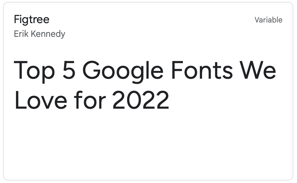
Meet Figtree, a friendly font that enjoys geometry and light, crisp fall air.
Figtree is a geometric Sans Serif perfect for headlines and short phrases like call-to-action text. It has a clean feel, with a slight art deco influence.
Try it out at the Regular font-weight or…
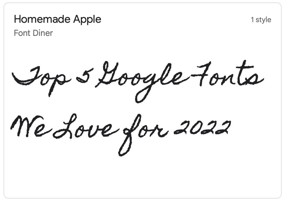
Everyone knows I am a sucker for an excellent handwritten font. You can’t use it everywhere, or even most places, but when you need a little bit of a down-home feel, some Homemade Apple will bring the sweet heat.
Handwritten fonts are for a very different use case than a grungey font like Rubik Dirt. Use handwritten styles when you need a little accent that feels like it might be from a scan or photocopy or an authentic document. In other words, get creative!
Sincerely,
The Sky Floor Team
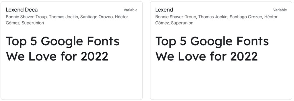
Lexend has a fascinating history. It was initially designed by creator Bonnie Shaver-Troup to reduce reading fatigue for those with dyslexia or trouble reading. As an Educational Therapist, Bonnie saw a need for a typeface specifically for struggling readers.
The font is an excellent all-around Sans Serif and makes great headlines and body copy. Give it a try in your next project!
